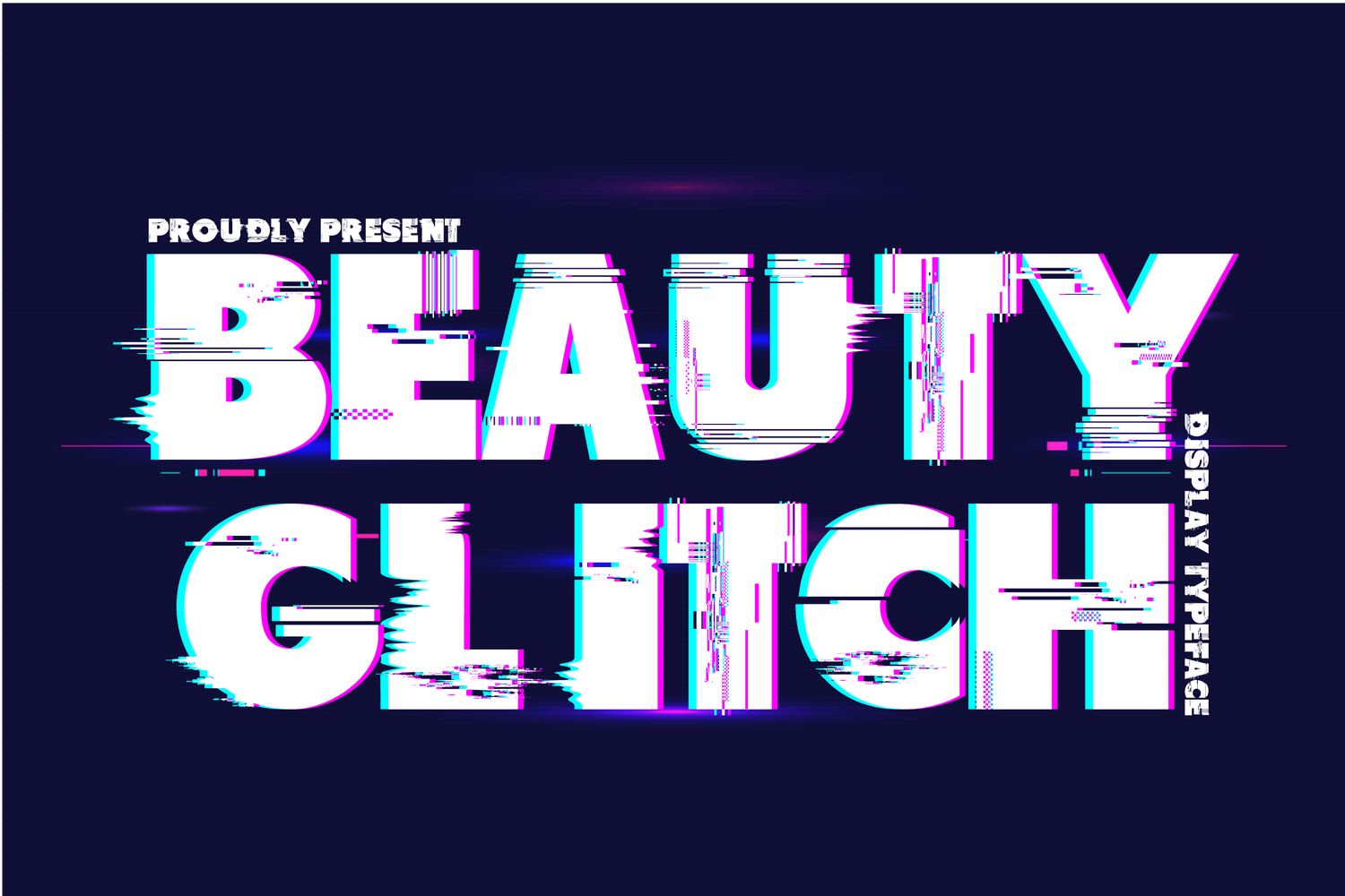
I really love the distortion effect on Beauty Glitch by 177Studio. The font itself is a bold sans-serif and the glitches are finely detailed for a really cool look. It's free for personal use only.
Download at FontSpace or buy at Creative Fabrica.
It's basically a reverse chronological record of my bookmarks with the occasional release announcement. Not sure where to start? Here are some of my most active tags:

I really love the distortion effect on Beauty Glitch by 177Studio. The font itself is a bold sans-serif and the glitches are finely detailed for a really cool look. It's free for personal use only.
Download at FontSpace or buy at Creative Fabrica.
A baseball show...
It's been a while but I finally published an update to the Vue Inner Image Zoom package. Version 3.0.0 adds an imgAttributes prop and removes srcSet, sizes, alt, and title since those are all image attributes. I also added type definitions and a CHANGELOG.
In addition, I released a Vanilla JS package called Inner Image Zoom with the same functionality but framework agnostic. A new demo site for Vue and Vanilla JS is up here. This is all part of a larger migration to get all versions into one monorepo so it's easier for me to keep track of and to share utilities. The next step is to move over React Inner Image Zoom and then maybe branch out to other frameworks like Angular or Svelte.
If you run into any issues, please let me know.
This section features affiliate links, meaning I’ll earn a small commission (at no cost to you) if you decide to click through and make a purchase.
I mentioned last time that I was looking forward to the Zoom lecture Design Pioneers: African American Graphic Designers You Should Know (recording at link) and it was great. I’m a hobbyist when it comes to graphic design so my historical knowledge is pretty basic and all the information was new to me. Since I’m a sucker for all things vintage, my favorites were Georg Olden, Thomas Miller, and Emmet McBain and I’m hoping to do deeper dives in the future.
Tried out one new tool, WhoCanUse, a site that shows how different colors may be perceived by users with visual impairments.
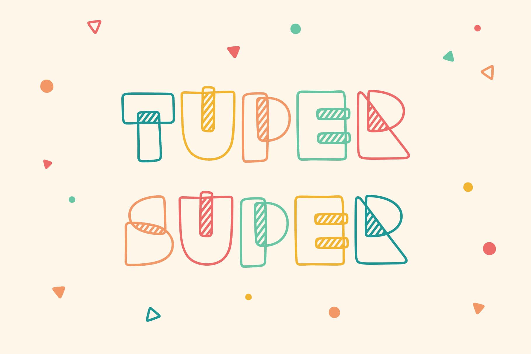
In font related news, I finally released something new! Tuper Super is a playful font made up of hand-drawn shapes with diagonal shading in the overlaps. Try it free for personal use or commercially for $15.
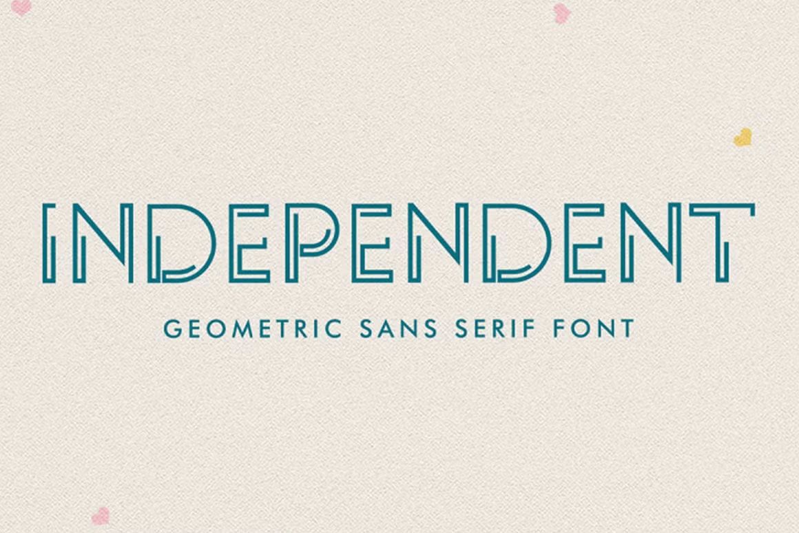
Recommended Independent by Lemon Studio Type. This geometric font has a sci-fi movie title card feel and can be downloaded for personal use at dafont or purchased for commercial use at Creative Market.
And read a really fascinating essay. The hardest working font in Manhattan by Marcin Wichary came out on Valentine’s Day which feels appropriate since it’s basically a love letter to a typeface. A long read full of gorgeous photographs and diagrams, it traces the history of Gorton across centuries and once you read it, you’ll see Gorton everywhere. As a side note, I want a Leroy lettering set so bad.
Picked up Character Limit: How Elon Musk Destroyed Twitter by Kate Conger and Ryan Mac and couldn’t put it down. This book is essential reading if you want to understand how DOGE (not a real department) is currently destroying the US government. It’s not just the same incompetence, malice, and egomania, they’re using the exact same tactics as well. At some points the cringe is hard to handle; there are meeting scenes that feel more uncomfortable than the UK Office. All in all, it’s a real page turner even if you don’t usually gravitate towards business books.
No Elon Musk low in Character Limit surprised me too much because I’d already read its spiritual predecessor Ludicrous: The Unvarnished Story of Tesla Motors by Edward Niedermeyer. If you’ve ever suspected that Tesla is a monorail and Elon Musk is con artist Lyle Lanley from the Simpsons pumping a meme stock, this well-researched book will confirm your wildest misgivings. If I ran a bookstore, these two would be on an end cap together.
Tangentially podcast related, as a fan of Mystery AI Hype Theater 3000, I signed up for the virtual event The Great Chatbot Debate with co-host Emily Bender on March 25th. Should be interesting.
Otherwise, I’ll be honest, the only new podcasts I added to the mix last month were recapping the reality TV show The Traitors. But if you’re a fan, Rob Has a Podcast and First to Breakfast are both good.
This was reposted from my newsletter on Beehiiv. To get next month's by email, sign up below.

And you can try it for free for personal use. Tuper Super is a playful, hand-drawn font made up of geometric shapes with diagonal shading in the overlap.
The name comes from a Taskmaster line and I'm sticking with it even though even I can't keep the order of the words straight.
Download it here and if you notice any issues or have trouble installing, please contact me.

Independent by Lemon Studio Type is a geometric sans serif with a sci-fi movie title card feel. The font is available in regular and rounded varieties and is free for personal use.
Download at dafont or buy at Creative Market.
This section features affiliate links, meaning I’ll earn a small commission (at no cost to you) if you decide to click through and make a purchase.
I had to set up a cookie consent management platform this month and it was a big “Google really is getting worse” moment for me. Maybe I’m romanticizing the results of a few years ago, but I swear the first two pages of a search like this used to be full of articles comparing the costs and features of major providers. Today, I found one neutral source (Top 12 Consent Management Platforms (CMP)) but it’s mostly ads and fake posts by the companies surprisingly ranking themselves number one.
The information shortage probably isn’t helped by the fact that a lot of platforms are tightlipped about pricing and really want you to do sales call. I eventually went with CookieYes because I appreciated their transparency and so far so good. It was easy to set up with Google Tag Manager. Integrating with Segment required a little more work but this repo saved me.
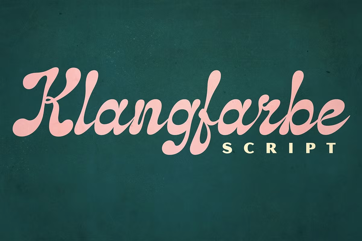
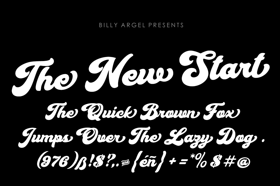
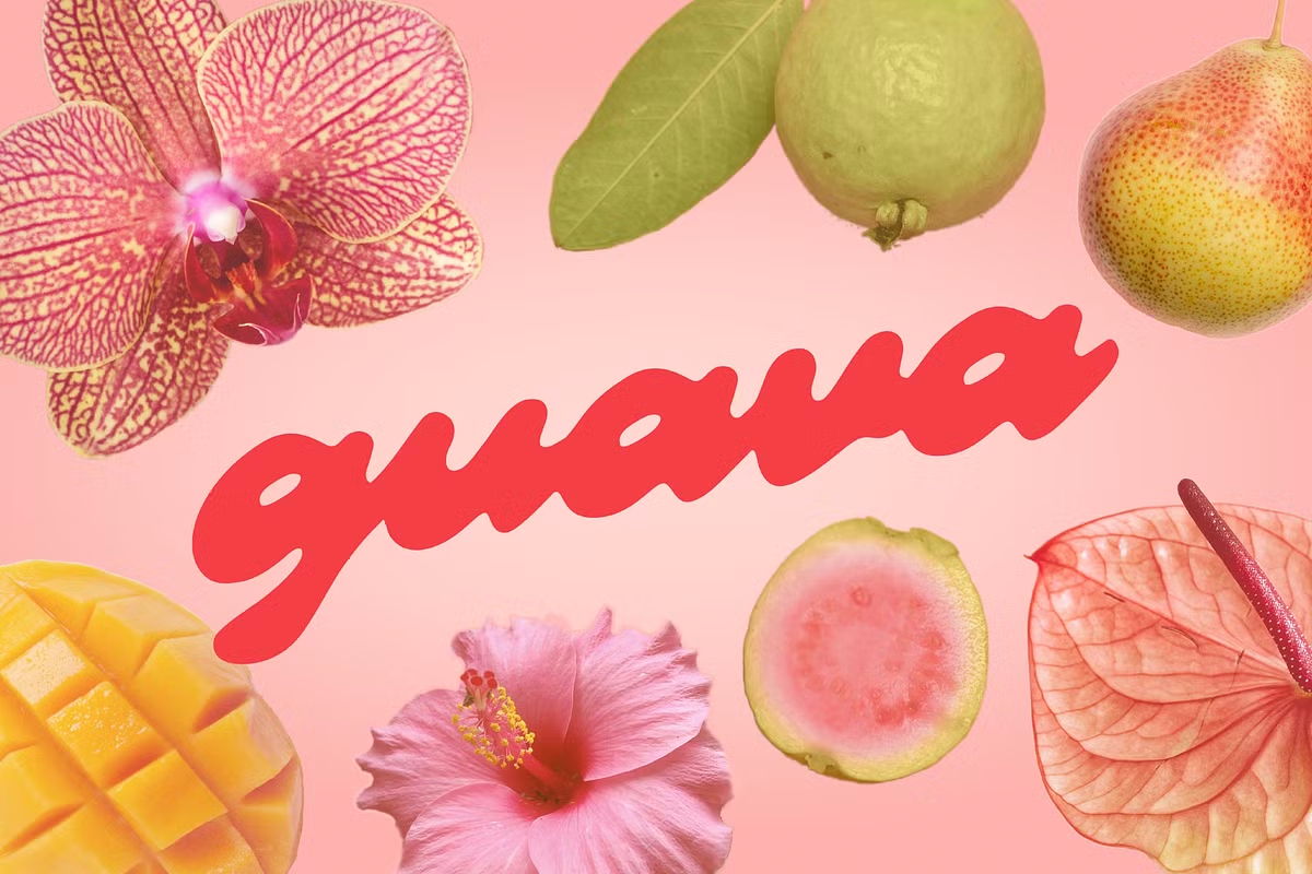
My sister asked me to help her find a font she saw in an Instagram ad that could best be described as thick or blobby cursive. Although I couldn't find an exact match, I recommended a few from the search: Klangfarbe by Mysterylab Designs, Blank’s Script by Billy Argel (also available free for personal use), and Guava by Meg Burk.
Tried a couple new tools that I’m pretty happy with:
Looking forward to these free online events in February:
Finished Technically Wrong: Sexist Apps, Biased Algorithms, and Other Threats of Toxic Tech by Sara Wachter-Boettcher at the end of December. It’s a little jarring to run across the line “I don’t know what the United States will look like by the time you read this book, and in fact I’m anxious it will look even bleaker than I can yet imagine” in a book about inequity and homogeneity in tech published in 2017. Things definitely are bleaker today, with companies like Facebook taking a vocal stand against diversity, but I think that makes this book a more interesting what could have been. Also the chapter on the illusion of the meritocracy hits really hard.
Reading Technically Wrong, I was reminded of a book I’d previously read, Weapons of Math Destruction: How Big Data Increases Inequality and Threatens Democracy by Cathy O'Neil, so it wasn’t surprising to see it referenced midway through. Weapons of Math Destruction examines how algorithms can exacerbate inequality by reinforcing the biases of their creators. With AI (or what we call AI right now), the risks of delegating decisions around school, work, health insurance, etc. to unaccountable black boxes seem even more obvious.
Speaking of tech’s rightward lurch, as a big fan of Ed Zitron’s Where’s Your Ed At newsletter, I started listening to Better Offline when it premiered last year but, it feels appropriate that I’m posting about it at a time when the industry deserves even more anger. At this moment, it’s especially cathartic to hear that you’re not imagining what he calls the “rot economy”, products getting worse (thanks Prabhakar Raghavan), bubbles preparing to pop (thanks OpenAI), and a general malaise engulfing the industry.
System Crash is a new podcast by Paris Marx from Tech Won’t Save Us and Brian Merchant, author of Blood in the Machine (which I just got from the library). The format may evolve over time, but for now it’s a good weekly wrap-up discussing events in tech from a skeptical perspective.
And for something completely different, 99% Invisible’s episode on the history of the typeface Fraktur is an interesting listen. I usually post positive font content so this is a bit of a departure.
He deserves worse as an out and proud fascist trying to destroy America but I still enjoy YouTubers realizing that Elon Musk is a fraud and a poser who lies about everything including his video game prowess. A lot of good content out there but my entry point was Elon Musk Fraud Gamer Situation is Pathetic by penguinz0.
This was reposted from my newsletter on Beehiiv. To get next month's by email, sign up below.
Peter Dörfell lives in Dresden Germany where he works in elder care, visiting clients at their homes, and to do that, he usually takes the bus. But one morning last September, he noticed something unusual as he boarded. “When I got on the bus, I see that the bus driver had put up a sign...
My sister asked me to help her find a font she saw in an Instagram ad that could best be described as thick or blobby cursive. Although I couldn't find an exact match (Klangfarbe below is probably closest), I did run across some good ones. I tried to include one free for personal use but the other two are commercial only.

The New Start (or Blank's Script Font because it's available as a duo) by Billy Argel.
Download at FontSpace or buy at Billy Argel Fonts.

Klangfarbe by Mysterylab Designs.
Buy at Creative Market.

Guava by Meg Burk.
Buy at Creative Market.
Better Offline is a weekly show exploring the tech industry’s influence and manipulation of society - and interrogating the growth-at-all-costs future that tech’s elite wants to build....