March Roundup
Some links below are affiliate links, meaning I’ll earn a small commission (at no cost to you) if you decide to click through and make a purchase.
Coding
I just finished moving the source code for two components (react-inner-image-zoom and vue-inner-image-zoom by) into a monorepo. The goals were to simplify code sharing, centralize GitHub notifications, and eventually add support for new frameworks. A few observations from the process so far:
- webpack-dev-server is a very effective tool for creating development sandboxes for multiple frameworks when you don’t need a full web app.
- The release-it package has cured a lot of my publishing anxiety. I’m always worried about bumping packages accidentally or messing up tags and the dry run functionality really offers peace of mind. My monorepo needs are pretty specific so I’m using it on the command line instead of with a CI/CD but I’ll probably try to figure out a better integration later.
- If you, like me, use nvm to manage Node versions and want to use npm link to test a new package, make sure that both the package and test project are using the same Node version. Also, if you’re testing that a package installs correctly, it’s not a bad idea to delete
node_modulesand add aconsole.logjust to be sure. And if that fails, this is a helpful Medium article on how to temporarily rollback and NPM package. - This is awesome: BrowserStack offers free access to test open source projects and I’ve found it invaluable for QA on Microsoft Edge and Android devices. Plus, the application process is quick and easy.
Like most normal people, sometimes I’ll see an animation on TV or in a game and wonder if it could be re-created in CSS. Over at CodePen, I’m giving the some segments from the Severance season finale credits a try. I only have the desks animation so far but I think the elevator and some of the abstract line art could also be possible. I’ll probably do a full post if I finish those. In the meantime, check out this YouTube video for the source inspiration.
Design & Fonts
Got out at the L train Grand St stop for the first time since the pandemic and the mosaics there are fantastic. “Gratitudes off Grand” by artist Glendalys Medina is colorful and abstract and generally made me happy walking by.
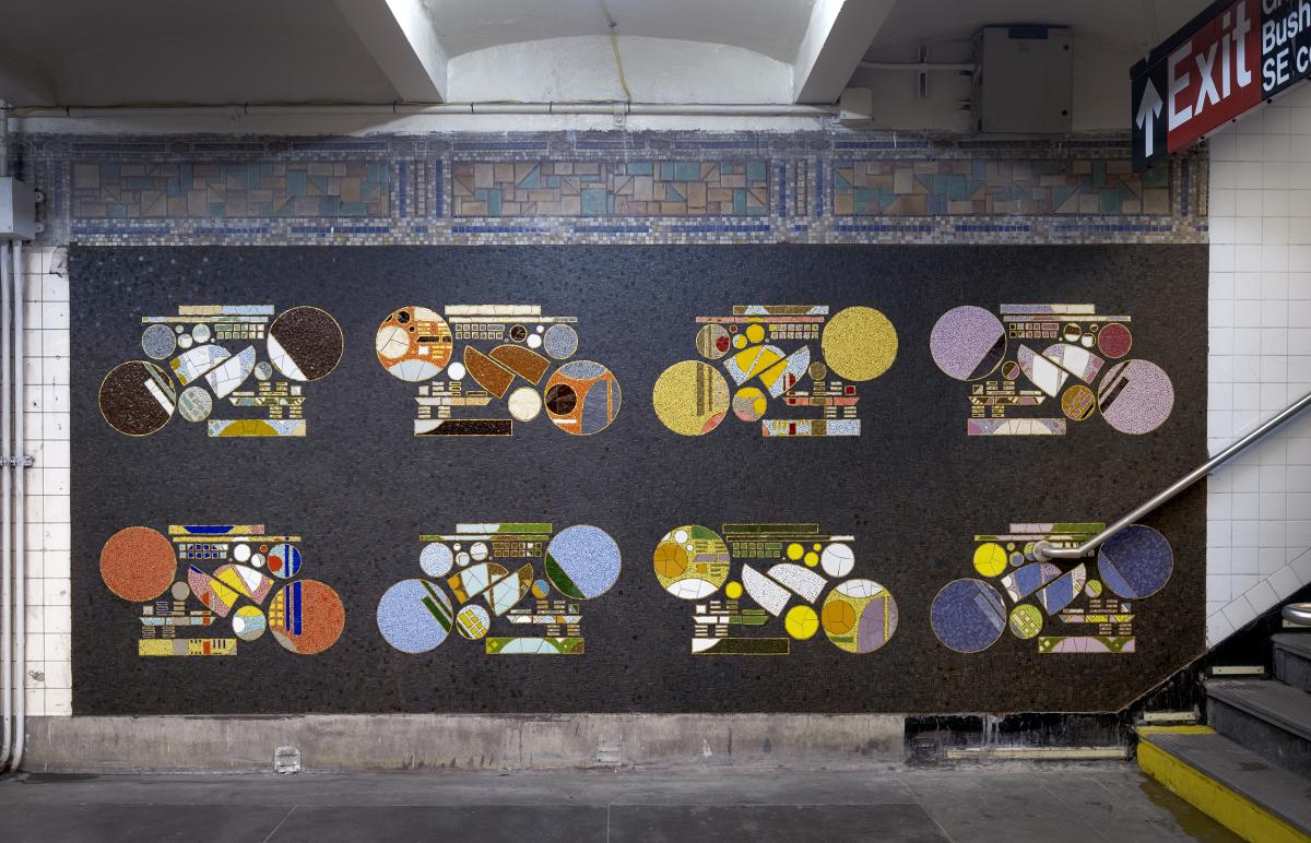
Photo by Osheen Harruthoonyan from the MTA website
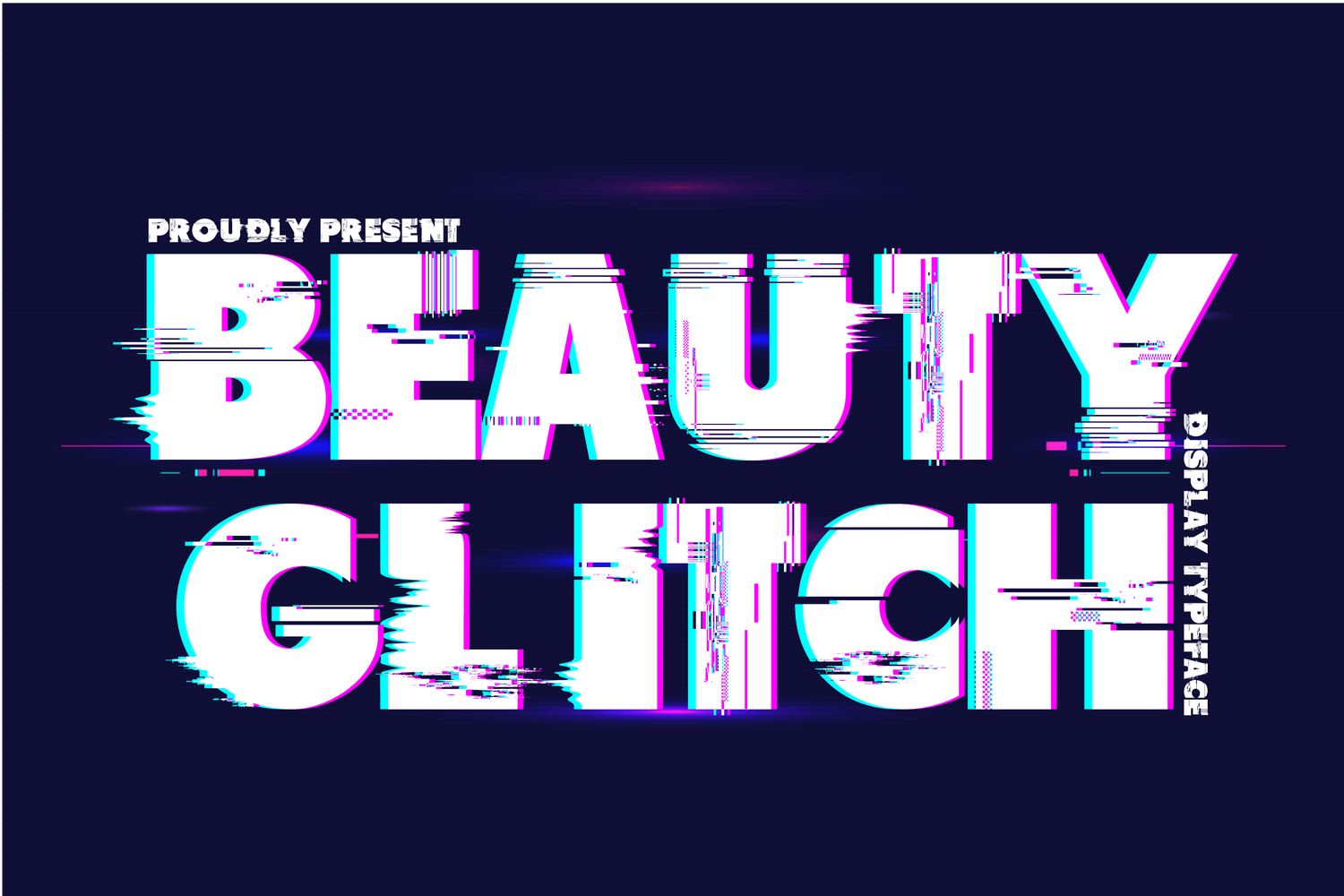
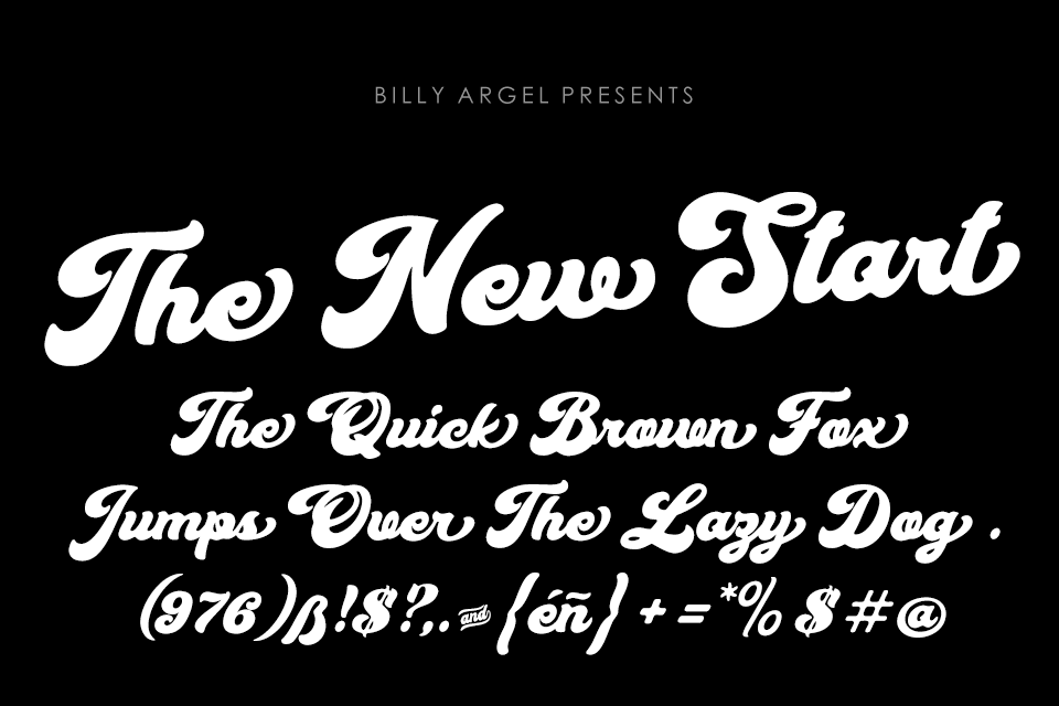
My font recommendation last month was Beauty Glitch by 177Studio. I love the distortion effect here to make the font look glitch-y. It can be downloaded for personal use at FontSpace or purchased on Creative Fabrica.
I also spent some time reading up on the fonts in Severance on the Severance Wiki Typography in Severance article and on Fonts in Use.
Books
Revisiting a few books I read last year since our reality now includes things like presidential memecoin rug pulls and cryptocurrency reserve quid pro quos propping up scams.
Easy Money: Cryptocurrency, Casino Capitalism, and the Golden Age of Fraud by Ben McKenzie and Jacob Silverman. Had to pick this up as a huge fan of both the OC and Gotham. It’s informative and well-researched but also super readable with an interesting side narrative around moving into journalism as an actor.
Number Go Up: Inside Crypto's Wild Rise and Staggering Fall by Zeke Faux. This book hits a little harder. It covers a lot of ground, you get an overview of various scams and shady characters, the rise and fall of Sam Bankman-Fried, and a lot of silly jargon. But what sets it apart is the deep dive into real world consequences in places like El Salvador, the Philippines, and (especially) Cambodia.
The Great Beanie Baby Bubble: Mass Delusion and the Dark Side of Cute by Zac Bissonnette. This book, along with Dan Olson’s classic video Line Goes Up – The Problem with NFTs, is all you really need to understand the NFT craze.
Podcasts
As a supportive spouse with no preexisting connection to any sports team, I’ve become a Mets fan out of household solidarity. And now I’m also a fan of Hits Different, New York’s only anti-math baseball podcast. What makes this the best sports podcast? The first episode of the season just came out and it opens with a discussion of the film Uptown Girls. The Mets are mentioned once in the first nine minutes and that’s while discussing the Olsen twins vehicle New York Minute.
This was reposted from my newsletter on Beehiiv. To get next month's by email, sign up below.


