Best 2024 Campaign Website Design
One thing I like to do when national politics have me spiraling into a panic (or, shockingly, when they have me feeling optimistic) is volunteer with Tech for Campaigns. If you have experience in engineering/product/design/etc. and want to help build websites or run email marketing for smaller campaigns, it's a great way to connect with talented, like-minded people and feel like you're actually helping.
As part of that, I've seen a lot of campaign websites this cycle. Sometimes the candidates recommend designs they like. Sometimes I'm out looking for inspiration. Since the content on these sites is generally very similar, it's interesting to see the different design approaches.
So, in no particular order, here's my partisan, totally subjective, and very non-exhaustive list of the best political website designs from 2024.
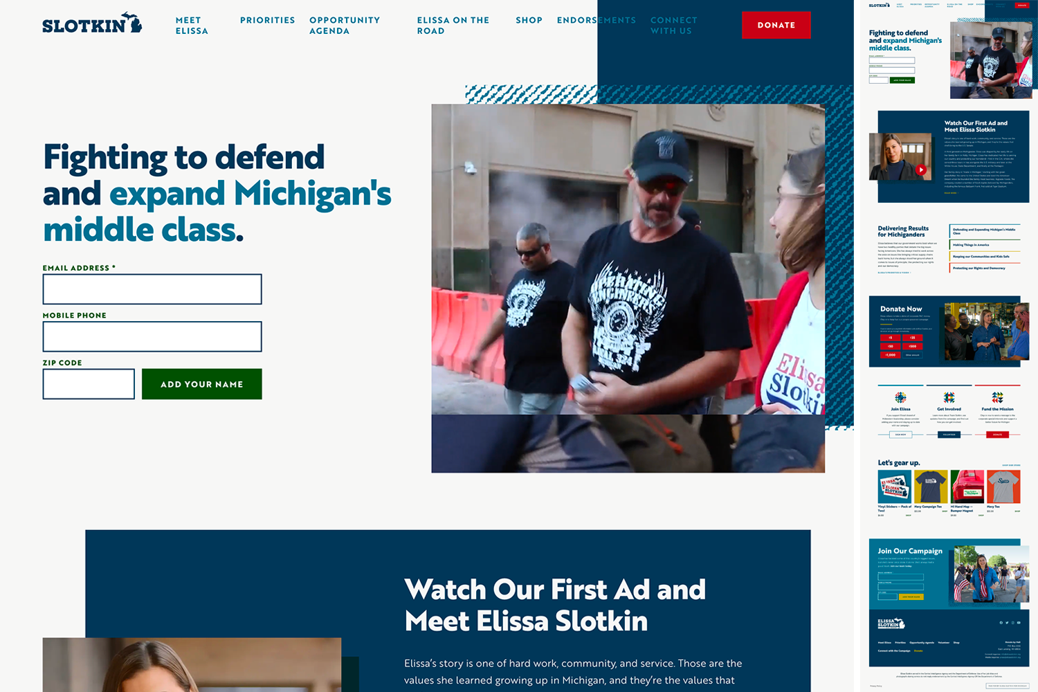
Elissa Slotkin for Michigan
This one is my favorite. Love the color palette, the background textures, and (most of all) the triangular decorative elements.
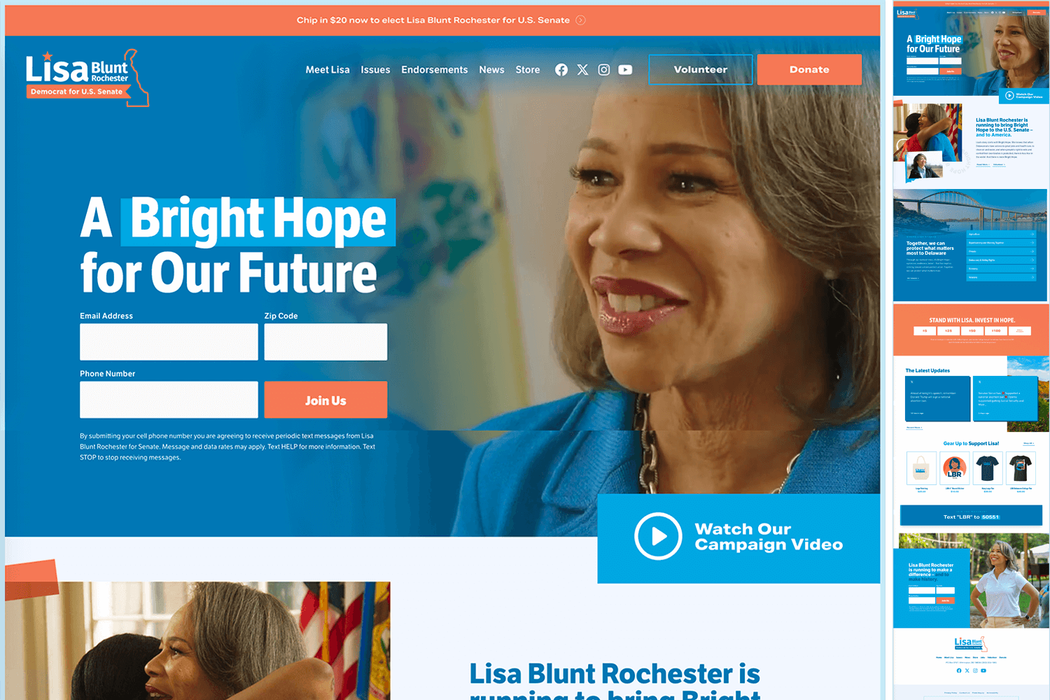
Lisa Blunt Rochester for U.S. Senate
Nice use of background photos. The transitions in the issues and latest updates sections are worth visiting the site to check out.
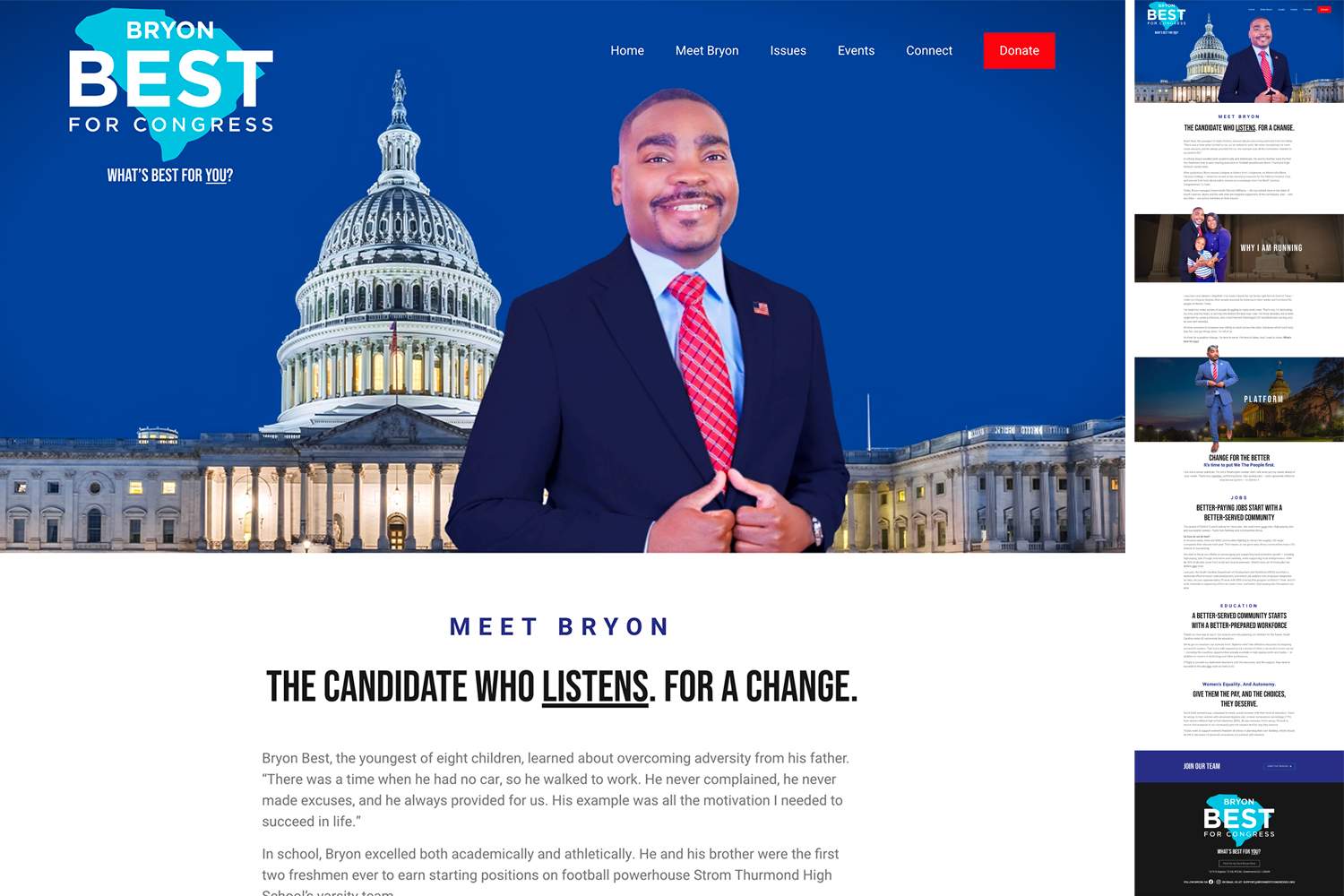
Bryon Best For Congress
A different approach to background photos that creates a very cool overflow effect.
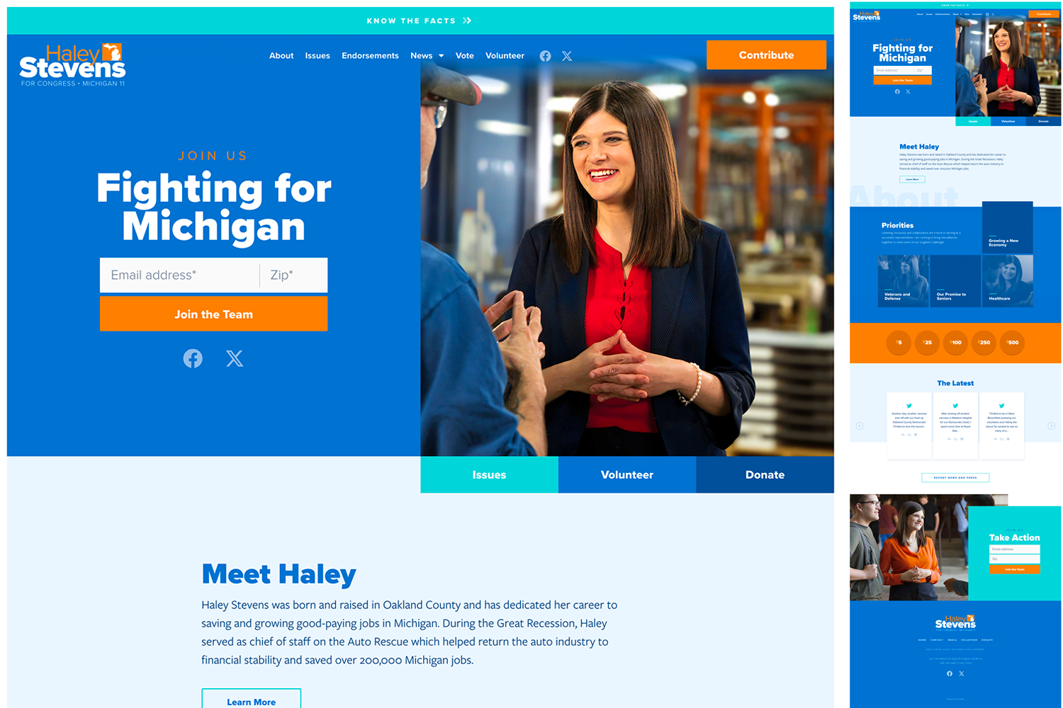
Haley Stevens for Congress
The colors here pop and they've managed to create a really eye-catching layout just using overlapping rectangles.
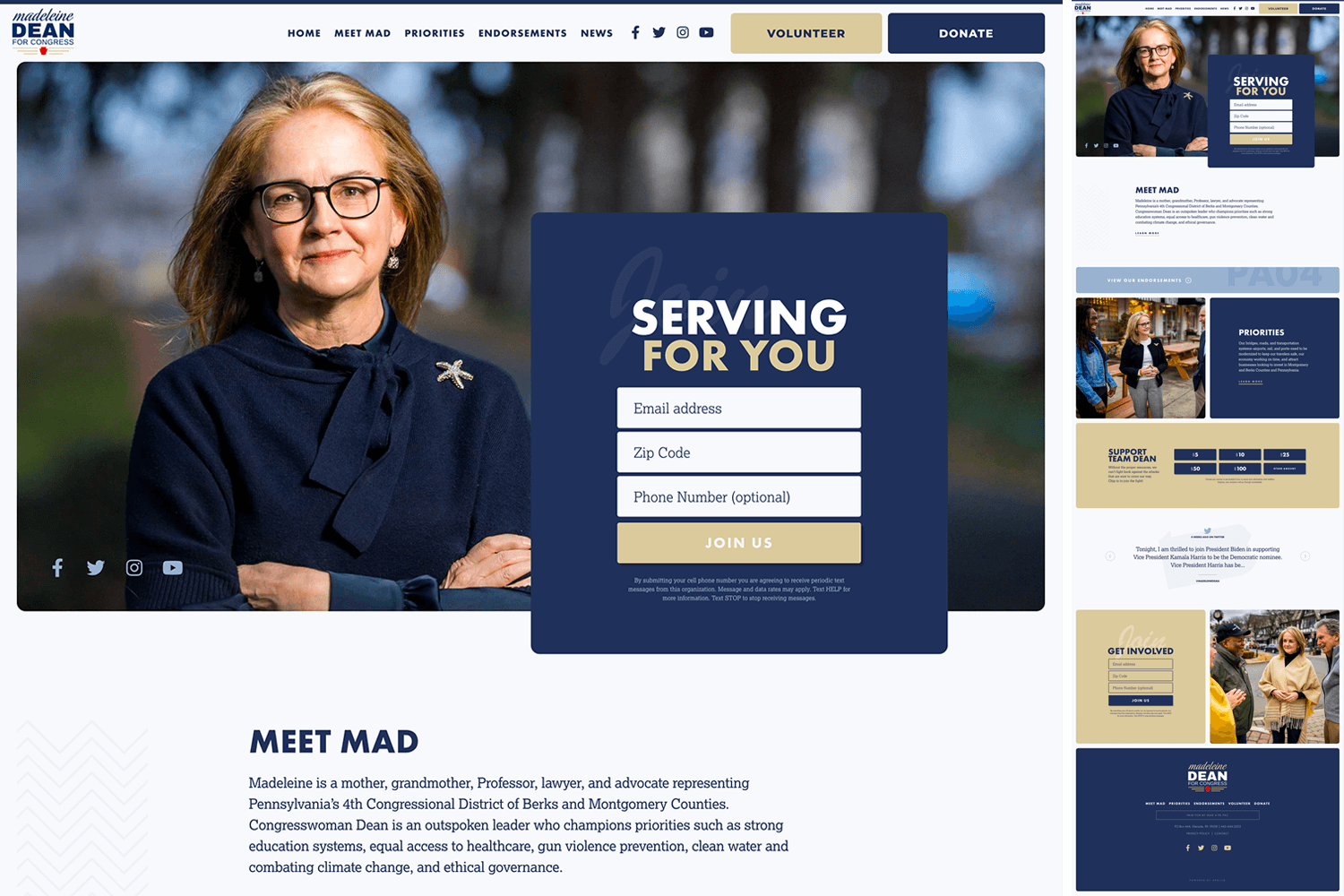
Madeleine Dean for Congress
A little more muted but everything about this site is so clean. The opaque design flourishes are subtle but keep things from feeling boring.
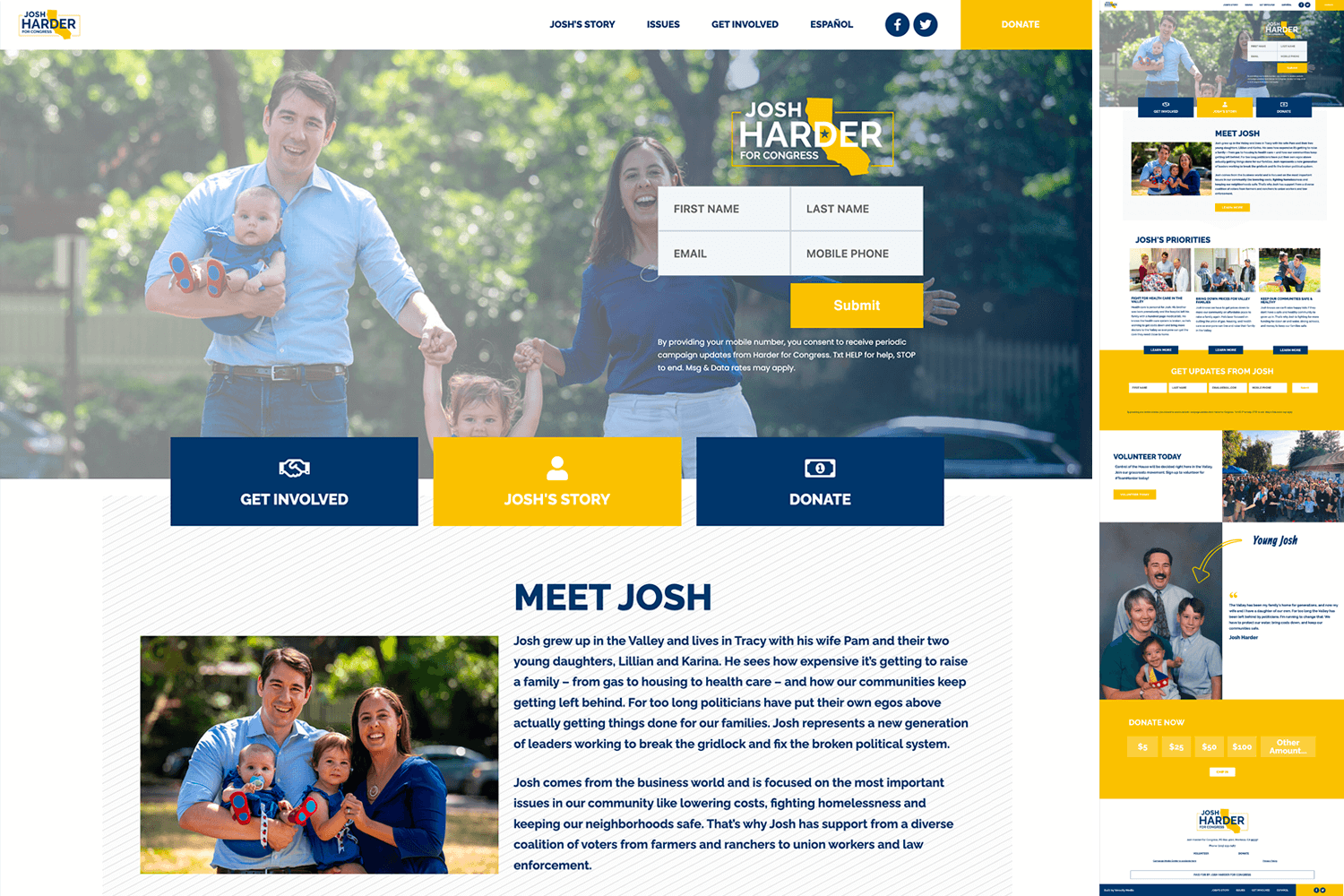
Josh Harder for Congress
Mostly included for the timeline on the Josh's Story page but the homepage layout is good too.
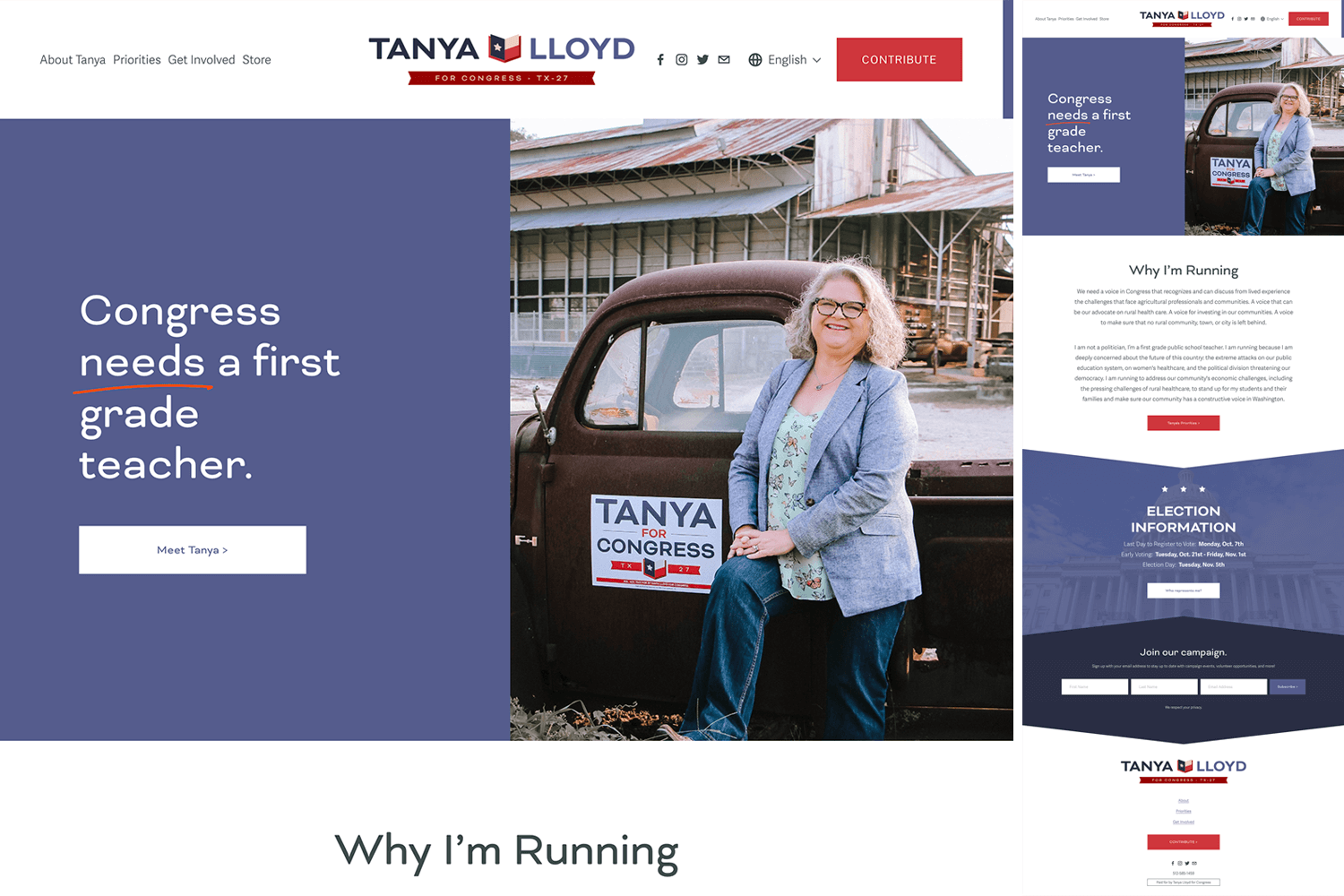
Tanya for Congress TX 27
A lot to like here! The Texas flag as a book logo for a teacher, the ribbon/bookmark motif, and the angled backgrounds complementing both. It all flows together really nicely.
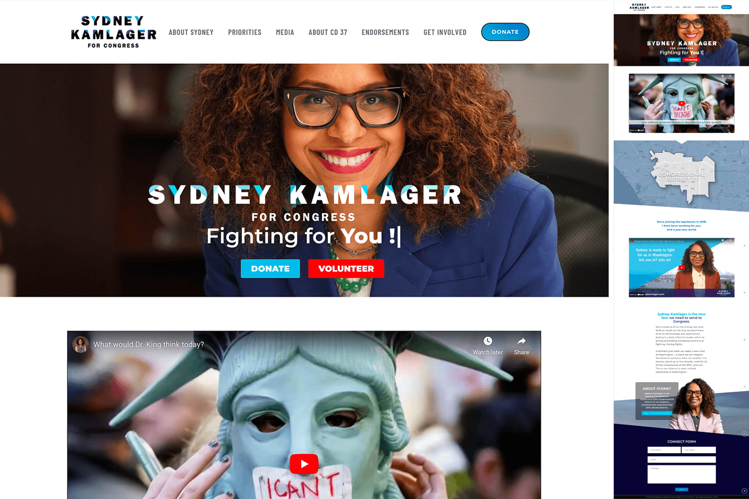
Sydney Kamlager – For Congress District 37
Another example of an angled background pairing well with a logo.

