All the Fonts I’ve Liked This Year
It’s the end of the year so here’s a roundup of all the fonts I’ve recommended in 2021. I know I’m missing a couple months so here’s hoping for the full twelve in 2022.
January - Jagiq by twinletter
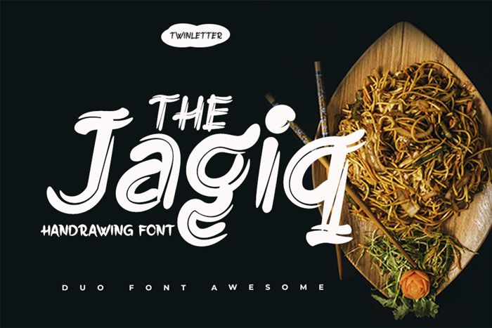
Download at Font Space or buy on Creative Fabrica.
March - Together of Love by goodigital
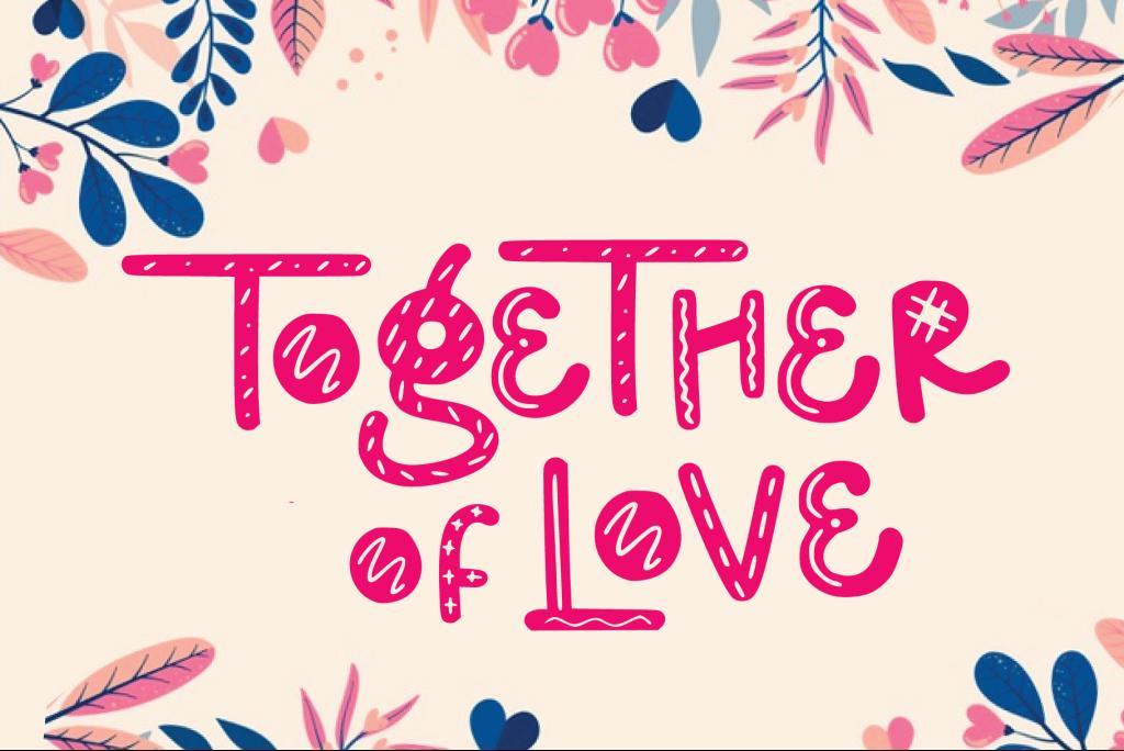
Download at 1001 Fonts or buy on Creative Fabrica.
June - Hot Dog by Toko Laris Djaja
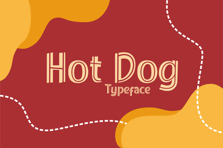
Download at dafont or buy on Creative Fabrica.
July - Ducky Manly by Allmo Studio
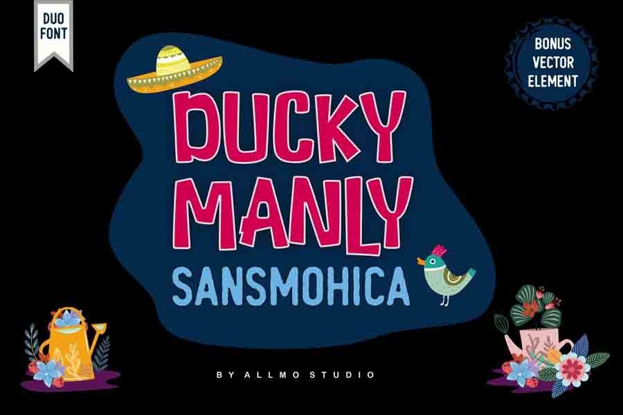
Download at dafont or buy on Creative Fabrica.
August - Cherish Today by Sarid Ezra
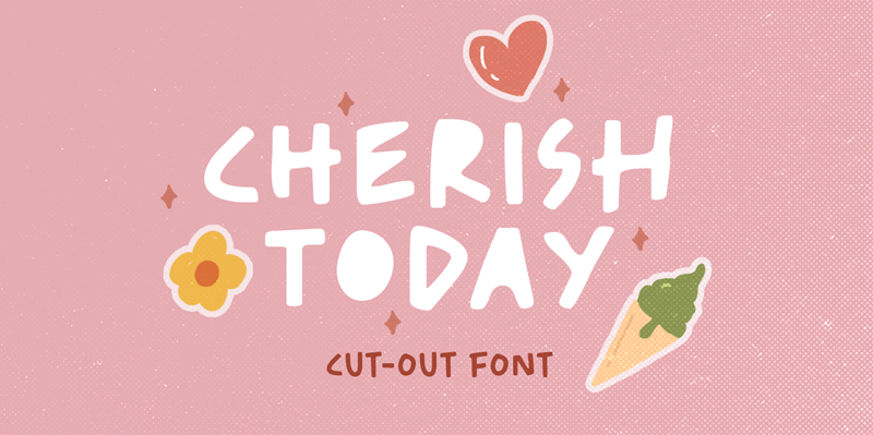
Download at dafont or buy on Creative Fabrica.
September - Black Ground by Letterhend Studio
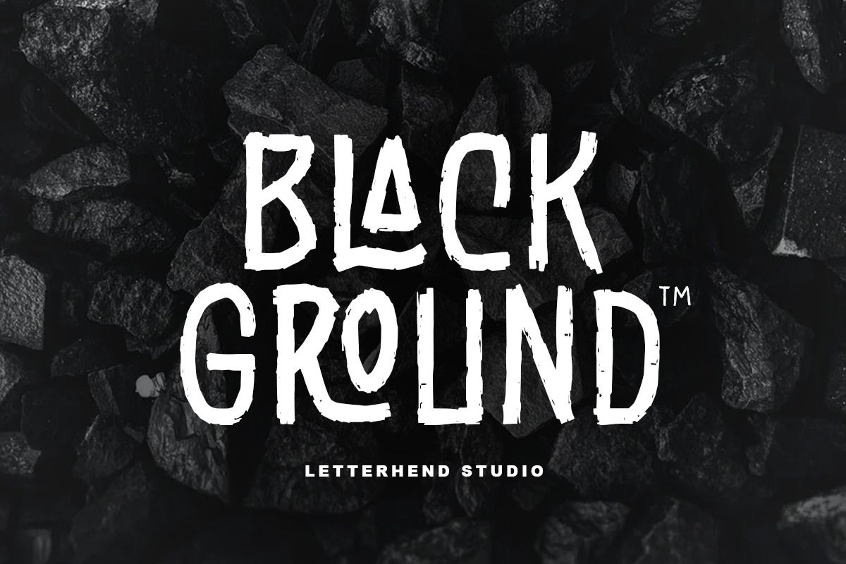
Download at FontSpace or buy on Creative Fabrica.
October - Organic Peach by Prioritype
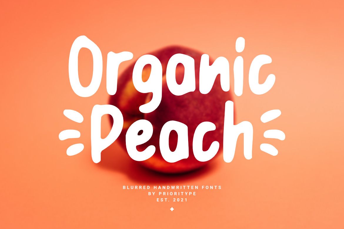
Download at FontSpace or buy on Creative Fabrica.
November - Javatages by Good Java Studio
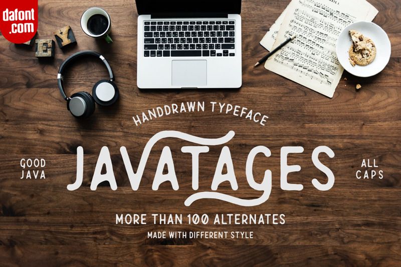
Download at dafont or buy on Creative Fabrica.
December - Fontanio by ArdyanaTypes
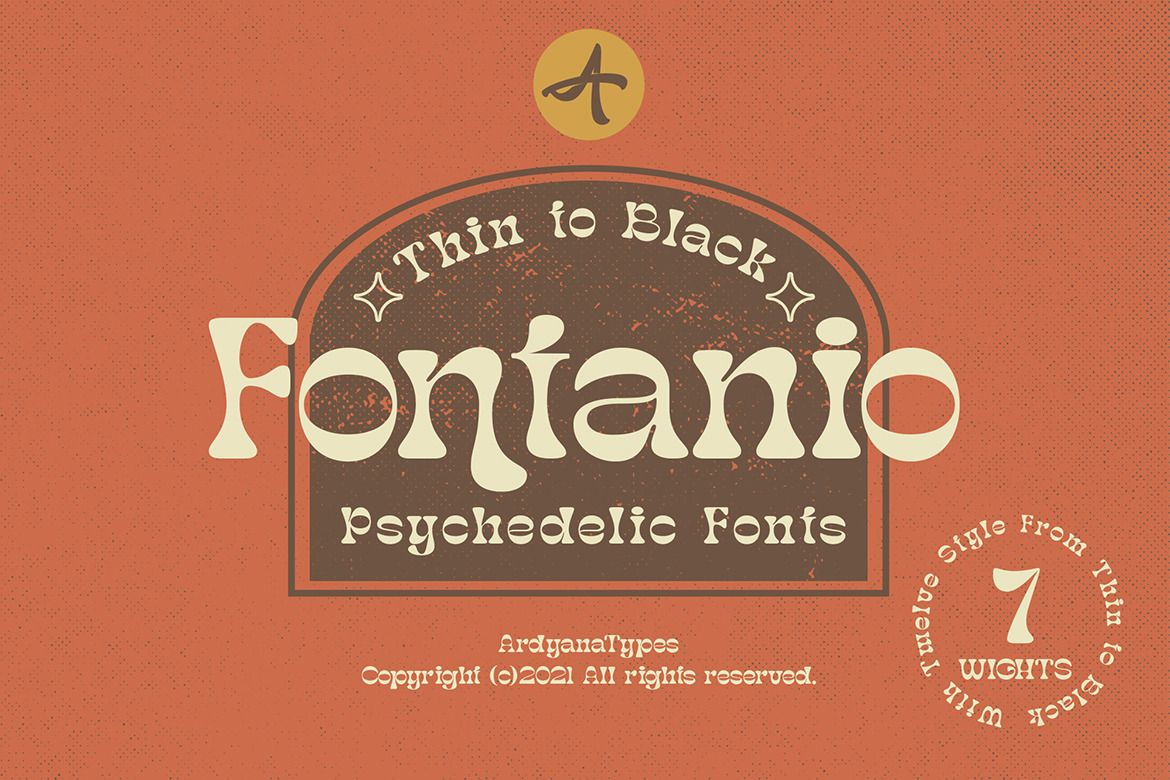
Download at FontSpace or buy at Creative Market.